Consider making "Find Usages" result leaner
I constantly find my self resizing my bottom window i VS whenever I do a R# Find Usages.
I typically get this (see below) when in fact all I am looking for is what is highlighted in red. I get it that some ppl may find the rest useful, but then perhaps have "Find Quick Usages" option or something.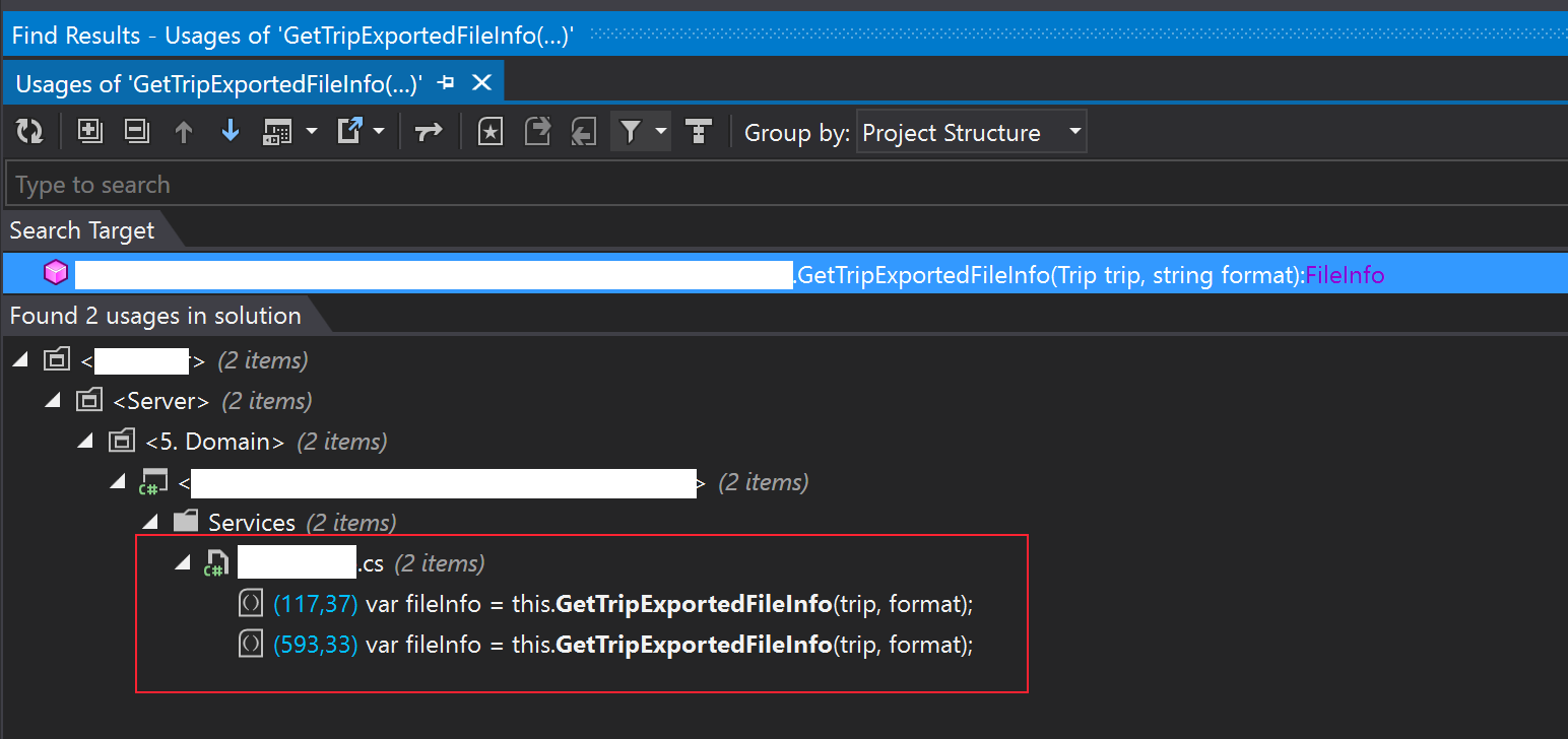
Please sign in to leave a comment.
Hello Johan
You might try using ReSharper | Navigate | Usages of Symbol action, it will show you usages as a list without a tree.
Also as for Find Usages window:
1) You might hide "Type To Search" field by clicking on "Pin" icon to auto-hide it.
2) Feel free to vote for https://youtrack.jetbrains.com/issue/RSRP-427686 ticket about Find Usages UI.
Thanks!
Have you tried the different options in the "Group by" list? I suspect "Type" would be close to what you want.
No actually not. It def helps a lot, but still leaves the tabs, toolbars, search field, etc which imo uses some precious space.
Thanks!